
Closed Caption Styling & Formatting Best Practices You Need to Know
Captioning Best Practices for Media & Entertainment [Free eBook]
Closed caption styling is an important element of video production that significantly impacts video quality and accessibility.
Traditionally, caption styling best practices were determined by television networks, streaming services, and captioning professionals based on feedback from D/deaf and hard of hearing communities. Guidelines from such entities as the Described and Captioned Media Program (DCMP), the Federal Communications Commission (FCC), and the World Wide Web Consortium (W3C) also played a key role in the development of best practices.
With the increase in video content and development of new captioning solutions over the past several years, caption styling has been unlocked for all video creators. This has come with an explosion in creative methods and DIY captioning. Unfortunately, creativity can sometimes come at the expense of accessibility, leading folks right back to conventional caption styling rules.
So how can you curate a captioning style that fits your video and brand while simultaneously maximizing the accessibility of your content?
In this blog, we will explore the best practices for closed caption styling and formatting. We’ll show you all of the styling elements you’ll need to consider, weigh the pros and cons of using different styles, learn why consistency is critical in any caption style, and provide tips for compiling your own captioning style guide to best support your brand’s content.
Caption Styling Elements to Consider
Whether you’re styling your own recorded captions or subtitles using YouTube or Premiere, or you’re in the process of creating your brand’s recorded captioning style guide, you will most likely be thinking about captions in pop-on format. Pop-on format is the most common captioning type for prerecorded video content, and it’s the only format available for subtitles. It allows for the greatest amount of customization in offline captions and subtitles.
Speaker Identification
Dashes: This is a simple way to identify new speakers. Use a dash followed by a space to indicate when a different speaker is talking.
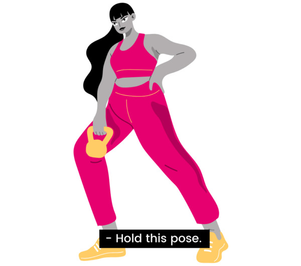
Name/title: This method identifies new speakers by name or title and can be helpful for viewers who want to know which character is speaking. Using names or generic titles to identify speakers can be done in several ways.
![Four identical images of a woman in workout gear holding a kettlebell. A closed caption with white text on a black background sits on each image to demonstrate different speaker IDs. The first reads "JANE: Hold this pose." The second reads "Jane: Hold this pose." The third reads: "(Jane) Hold this pose." "The fourth reads [JANE] Hold this pose."](https://www.3playmedia.com/wp-content/uploads/2023/11/name-ID-600x600.jpg)
Speaker-oriented placement: This identification style uses manual horizontal caption placement to follow each speaker around the screen. Dashes and names may be used in addition to this style, or they may have no identification at all unless they are off-screen. This style can be useful for those who struggle with center-placed identification, but others may find this style distracting and hard to follow.
Overall, the use of speaker-oriented placement has been moving out of favor due to its incompatibility with many internet-based streaming platforms and video players.
Placement
Bottom-center only: This style is compatible with almost every television and online video player. It is often the default on some web players, and is sometimes the only placement option for certain web caption file types. Despite its compatibility, bottom-center placement can obscure lower-third video graphics if they are present.
Bottom-center, moving for lower thirds: This style is standard for many television and streaming networks, and many captioning vendors adhere to this placement by default. Captions stay in the bottom, center portion of the screen and are placed on the top of the screen when lower-third graphics are present.

Speaker-oriented: As mentioned in the previous section, this style of placement is becoming less common because of its incompatibility with some web video players. This style can also be distracting and difficult for some viewers to follow.
Narration and Off-Screen Speech
Italics: Italics are commonly used to differentiate voice-over narration and off-screen speech. They are sometimes used in tandem with speaker IDs.
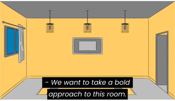
Descriptors: Name descriptors may be used in addition to italics to indicate off-screen speech or narration. They are sometimes used without italics, as the means for indicating off-screen speech.
![Two images of the same empty room of a house. Top image: A closed caption in white text on a black background on top uses no italics and parentheses to identify the narrator. It reads "(narrator) We want to take a bold approach to this room." Bottom image: A closed caption in white text on a black background on top uses no italics, uppercase text, and brackets to identify the narrator. It reads "[NARRATOR] We want to take a bold approach to this room."](https://www.3playmedia.com/wp-content/uploads/2023/11/descriptor-off-screen-2-e1699041135706-515x600.jpg)
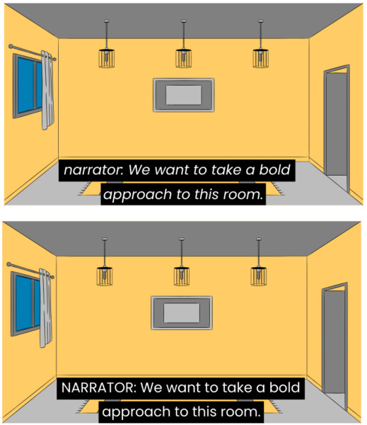
Sound Effects, Music, and Other Non-Speech Information
Brackets: This style uses brackets to enclose sound effects or music descriptors. Brackets usually surround words in lowercase, without spaces. Sometimes, sound effects may be in uppercase or include additional spaces/italics as well.
![Four images of the same set of trees blowing in the wind. Each image has a closed caption in white text on a black background located in the bottom center of the image. Each image uses brackets to indicate a "wind howling" sound effect. Top left contains brackets with no spacing: [wind howling]. Top right contains brackets with no spacing in uppercase: [WIND HOWLING]. Bottom left contains brackets with spaces: [ wind howling ]. Bottom right contains brackets with spaces in uppercase: [ WIND HOWLING ]](https://www.3playmedia.com/wp-content/uploads/2023/11/bracket-descriptors-e1699041446732-600x543.jpg)
Parentheses: This style is almost exactly used like the brackets style, but includes parentheses to indicate sound effects instead.
Detailed descriptors: Highly detailed descriptors have gained traction with many hearing caption users due to their creativity and entertainment value. These can be a fun way to help immerse viewers in a program. However, it’s important to note that these can also confuse other viewers, particularly when advanced vocabulary is used in the descriptor.
![Trees blowing in the wind with a closed caption in white text on a black background located in the bottom center of the image that reads in brackets: [treacherous Aeolian howling]](https://www.3playmedia.com/wp-content/uploads/2023/11/detailed-descriptor-e1699041898689-600x460.jpg)
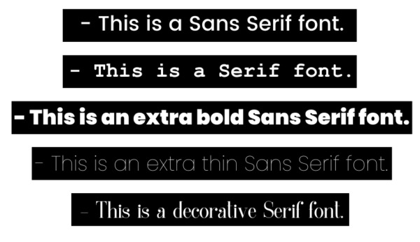
Font, color, and character limits
Font: Sans Serif fonts with medium thickness are preferable for captions. Serif fonts can be used when they are simpler but tend to be less readable for viewers in general. Overly thin or bold fonts can additionally pose issues with readability. The more decorative a font is, the harder it may be for viewers to read.
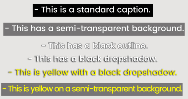
Color: Closed captions are typically displayed as white text on an opaque or semi-transparent black box. Subtitles are often styled in white text with a black outline or black drop shadow. These tend to be the most readable colors for viewers, but open captions and open subtitles can be styled in other colors. Choosing different colors can be a creative way to extend branding, but caution should be used to ensure appropriate contrast is provided.
Character Limits: Closed captions have a line limit of 32 characters per line by default. Subtitles can have varying line limits, but are often capped at 42 characters per line to best support readability.
Profanity and Censorship
Bleeping: When bleeps are used to censor audio, the profanity is typically reflected as [bleep], (bleep), or [BLEEP] within the captions.
Dropped Audio: When audio is entirely dropped or silenced, the profanity is usually reflected as […] or (…) within the captions.
Partial Censorship: When words are partially censored in the audio, or if producers wish to indicate the word being used in the captions, profanity can be transcribed using the first and/or second letter of the word followed by asterisks or dashes, such as sh– or sh**. Note that dashes are preferable due to asterisks’ display incompatibility with certain caption file types and players/televisions.
On television, 608 captions are unable to be customized by viewers, but digital 708 captions do have the capability for user customization, with choices for font, color, size, and background. Some streaming platforms and online video players additionally support customization options to varying degrees, such as YouTube.
Consistency in Caption Styling is Key
There is no blanket guideline for caption or subtitle styling. This can be great for creativity, but less so for accessibility. That’s where consistency comes in.
Consistency in Broadcast and Streaming
Video accessibility requirements for the FCC and WCAG, for example, are broad enough to allow for different caption styling options. However, it’s important to remember that content going to broadcast networks and streaming services, such as Netflix or Amazon, may require particular styling guidelines to be met. This helps each individual platform or network create greater consistency for captions and subtitles within their libraries of programming.
When applicable, network or streaming style guides should always be consulted and followed before defaulting to any other style. Some captioning vendors, like 3Play Media, are familiar with and well-versed in handling these specs, but always ensure they have the most updated style guides to review prior to caption creation.
If your content is being distributed to a network or platform without any specifications beyond following FCC guidelines, your captioning vendor will typically default to their house style. A caption vendor’s house style should integrate key compliance requirements and major recommendations from organizations like DCMP.
Consistency in Non-Entertainment Video Content
For video producers, organizations, and individuals with recorded video content not geared toward entertainment–including corporate training videos, brand videos, educational videos, event recordings, and more–ensuring a consistent caption style can help optimize both accessibility and branding. But how can you do this? Where do you start?
To create greater consistency across video content, it can be useful to review other style guides, talk to a captioning vendor about their house style, and watch captioned videos across different players and platforms. In fact, many captioning vendors, networks, and streaming services have designed their caption style specs with guidance and suggestions from disability communities and organizations over the years.
However, even the standard best practices can become outdated or may no longer best meet the needs of D/deaf and hard of hearing communities. That’s why it’s incredibly important to research the current preferences of these communities in order to gain a holistic view of caption styling priorities from the people who rely on them.
Keep in mind that every individual will have their own preferences and reasoning behind their choice in caption styling. Because one cannot speak for the entirety of caption users, these preferences may not always be within the general best practices for captioning, but should still be considered when crafting your own caption style.
Building a Captioning Style for Your Brand
When creating a captioning or subtitling style guide for your brand, remember that accessibility must be placed before aesthetics. Using your brand’s font and colors may support a consistent brand experience, but they can also be illegible to caption users if a font is too fanciful or colors don’t have enough contrast. Overly detailed sound and music descriptions may be entertaining and provide hearing caption users with a memorable brand experience, but they can also be distracting and confusing to others who need them to understand your video. Plus, it’s important to remember that not all captioning customizations display the same way across web platforms and televisions unless they are permanently burned in.
So with all of these caveats, how can you create a consistent and accessible captioning experience that supports your brand and complements your video content?
Choose Your Basic Style Requirements
Closed captions are not permanently burned into the video, unlike open captions or subtitles. Therefore, style elements like font, size, and color should not be considered during this stage.
Stick to determining the basics of closed caption styling elements. How should speakers be identified? How do you want sound effects and music formatted? How should off-screen speech be indicated?
Once you figure out the basics, document your preferences so that they can be followed by your captioning vendor.
Choose Advanced Captioning Style Elements
After creating your basic preferences, you may begin selecting advanced captioning style elements if you will be creating or adding permanently burned-in open captions or open subtitles for your video content.
Take your own brand and preferences into account here, but make adjustments and considerations for accessibility as you do so. If you’re looking for a font, and your brand font is non-Serif with medium thickness, it will likely be readable in captions. If it’s Serif, decorative, has very thin lines, or is overly bold, there may be readability issues.
When determining caption or subtitling color, consider utilizing a color contrast checker to ensure captions have enough contrast to support readability. For subtitles, consider how the use of outlines, drop shadows, and semi-transparent elements can improve contrast.
Put Your Captioning Style Guide to Use
Now it’s time to test your style elements together. How do they look in your video content? What do your viewers and caption users think? Do your caption styling preferences support captioning best practices?
After successful testing, you can go live with your new captioning style. Provide a copy of your style guide or requirements to your caption vendor, and review your files–ideally in the final video platform or player–to confirm the finalized caption display is accessible and to ensure overall consistency and compatibility.
This blog was originally published by Kelsey Brannan on November 1, 2016, as “Guest Post from PremiereGal: Trends in Captioning Style & Formatting” and has since been updated for comprehensiveness, clarity, and accuracy.
Further Reading


Subscribe to the Blog Digest
Sign up to receive our blog digest and other information on this topic. You can unsubscribe anytime.
By subscribing you agree to our privacy policy.