
Resource Library
Discover a rich library of expert insights, practical guides, and cutting-edge research designed to help you make your video and digital content more accessible, inclusive, and compliant.
Webinar Series
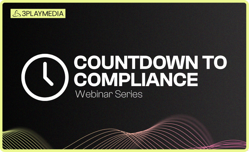
ADA Title II: Countdown to Compliance
The countdown is on for public entities (including public colleges and universities) to meet the ADA Title II compliance deadlines coming in April 2026. In this 6-part webinar series, you’ll get step-by-step guidance to achieve video accessibility compliance — from unpacking the nuances of the Title II ruling to creating scalable, sustainable video workflows.

-
 Read more: You Ask, Experts Answer: A Community Q&A on ADA Title II Compliance
- Webinars
You Ask, Experts Answer: A Community Q&A on ADA Title II Compliance
-
 Read more: AI Dubbing vs. Traditional Dubbing: How Media Leaders Should Choose in 2026
- Dubbing
AI Dubbing vs. Traditional Dubbing: How Media Leaders Should Choose in 2026
-
 Read more: ADA Title II Deadline Extended: What This Means for Public Entities
- Legislation & Compliance
ADA Title II Deadline Extended: What This Means for Public Entities
-
 Read more: 8 Best AI Dubbing Tools in 2026
- Dubbing
8 Best AI Dubbing Tools in 2026
-
 Read more: What Is AI Dubbing? The Complete Guide for 2026
- Dubbing
What Is AI Dubbing? The Complete Guide for 2026
-
 Read more: The Complete Guide to YouTube Dubbing: The Key to Global Growth
- Dubbing
The Complete Guide to YouTube Dubbing: The Key to Global Growth
-
 Read more: 3Play Media Launches AI Dubbing Solution for YouTube Creators Ready to Go Global
- Company News
3Play Media Launches AI Dubbing Solution for YouTube Creators Ready to Go Global
-
Read more: How to Build an Audio Description Strategy That Actually Works
- Webinars
How to Build an Audio Description Strategy That Actually Works
-
 Read more: What Is Pulse by 3Play Media? A Complete Breakdown
- Pulse
What Is Pulse by 3Play Media? A Complete Breakdown