
Resource Library
Discover a rich library of expert insights, practical guides, and cutting-edge research designed to help you make your video and digital content more accessible, inclusive, and compliant.
Webinar Series
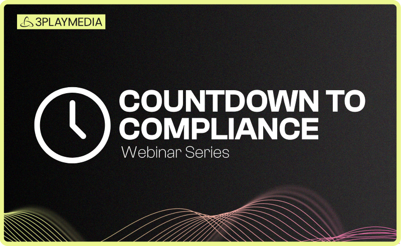
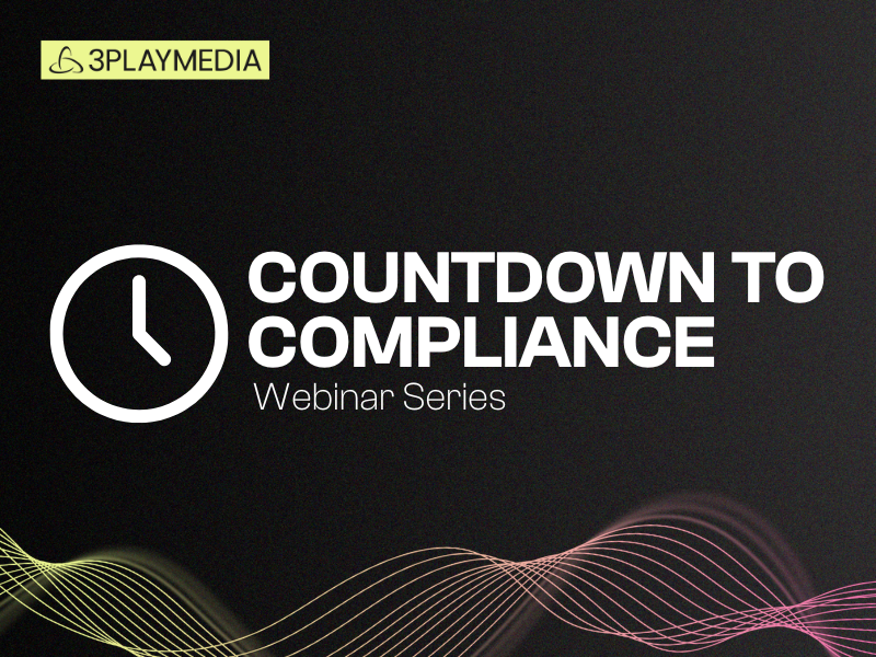
ADA Title II: Countdown to Compliance
The countdown is on for public entities (including public colleges and universities) to meet the ADA Title II compliance deadlines coming in April 2026. In this 6-part webinar series, you’ll get step-by-step guidance to achieve video accessibility compliance — from unpacking the nuances of the Title II ruling to creating scalable, sustainable video workflows.
-
 Read more: Press Release: 3Play Media Launches Pulse, the First All-in-One Auditing and Remediation Solution for Video Accessibility
- Pulse
Press Release: 3Play Media Launches Pulse, the First All-in-One Auditing and Remediation Solution for Video Accessibility
-
 Read more: Meet Pulse: The New Standard for Video Accessibility Monitoring
- Webinars
Meet Pulse: The New Standard for Video Accessibility Monitoring
-
Read more: Accessible & Compliant Course Design
- Webinars
Accessible & Compliant Course Design
-
Read more: Spend Smarter, Stay Compliant: The Power of Predicted Accuracy
- Webinars
Spend Smarter, Stay Compliant: The Power of Predicted Accuracy
-
 Read more: Which Languages Are Required for EAA Compliance?
- Localization
Which Languages Are Required for EAA Compliance?
-
 Read more: Accessibility Laws for Public Colleges
- Legislation & Compliance
Accessibility Laws for Public Colleges
-
 Read more: How to Create Audio Description for YouTube Videos
- Audio Description
How to Create Audio Description for YouTube Videos
-
Read more: 2025 U.S. Digital Accessibility Legal Update with Lainey Feingold
- Webinars
2025 U.S. Digital Accessibility Legal Update with Lainey Feingold
-
Read more: Building a Budget for Video Compliance with the University of Florida
- Webinars
Building a Budget for Video Compliance with the University of Florida