

- Accessibility
Introducing Our New Brand Identity
•
![]()
Over the past several weeks, you may have noticed some updates to our brand identity. As we continue rolling out these changes, I wanted to take a moment to share more about our rebrand and why it better reflects who 3Play Media is today.
3Play Media began in 2008 as a closed captioning company. Now, 13 years later, we do so much more – but our brand was still focused on what we did back then. While captioning is still a core part of our business, we have evolved into a dynamic, integrated platform providing all the services you need to make video accessible and engaging.
WHY REBRAND?
At this point in our business, our suite of services and features is extensive and ever-expanding, and our customers are using 3Play Media in myriad ways to meet diverse and ambitious video accessibility, globalization, and engagement goals. We are constantly inspired by our customers, and their goals push us to continue innovating – which we love. There is nothing that gets us more excited than building new technology to solve emerging needs in our space.
We’re making these brand changes for a few reasons, including to have a more modern and consistent look and feel, but ultimately it is to better reflect our commitment to our customers. This commitment goes beyond meeting your needs today: our goal is to future-proof your content for what might come down the road – be it new workflows, new products, or new legal requirements. Our updated brand identity says with confidence that we have you covered, now and in the future.
Here’s more specifics on what you can expect to see from 3Play as we continue our brand rollout.
COLOR
Historically, our brand color has been “3Play Blue.” Our new palette focuses on black and white as our primary colors, with magenta, yellow, and blue as secondary pops of color. Keeping 3Play Blue as a secondary color allows us to maintain existing associations while modernizing and changing how we use it. All of these colors were chosen by pairing our brand identity with the psychology of color to visually tell the story of our rebrand.

The focus on black and white highlights our commitment to being transparent about who we are, what we do, and how we do it. It also reflects our core product of captioning by mimicking traditional white-text-on-black-background closed captioning.
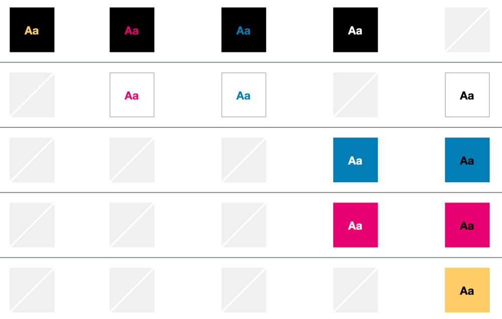
Finally, in line with our broader commitment to accessibility, black and white is the most accessible color combination, with a color contrast of 21:1. We have additionally tested our entire color palette for color contrast and color blindness, and have clear guidelines on accessible color combinations.
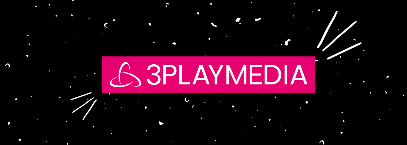
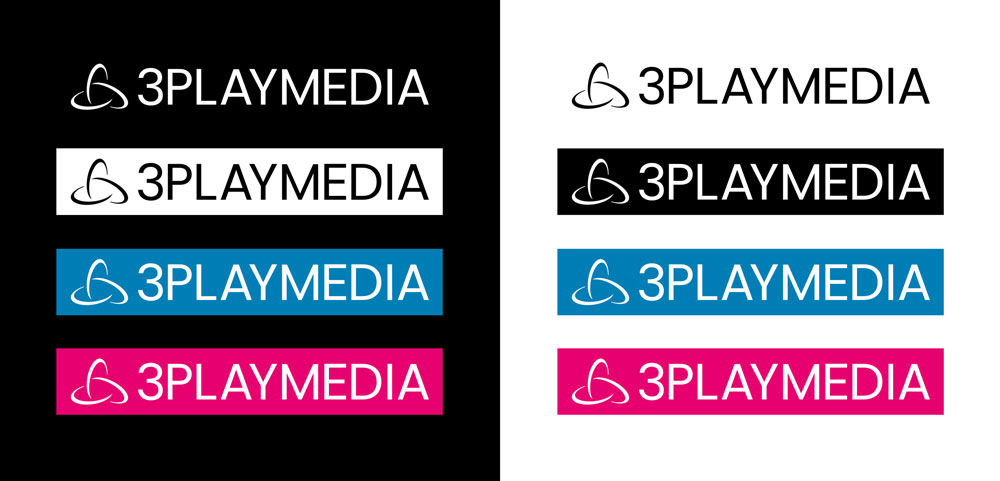
LOGO
Our new logo is simple and modern with bold color contrast. We’ve updated the text of our logo to have a single font weight in all caps, designed in our primary font of Poppins. This better aligns our logo with the rest of our branding and website. Additionally, we’ve kept our brand icon, but have removed the gradient and made the icon & text monochromatic.
Our primary logo usage will be black on white or white on black, with variants that incorporate our secondary colors. The blocky, solid background of our new logo mimics caption frames. This abstract representation of our core product visually associates our brand with what we do; and while captioning is not all that we do, it’s what we’re known for.
ROLLOUT
Our customers are our favorite part about what we do: they are companies that value digital inclusion and push the boundaries of how accessibility can make video better every day. That’s not just awesome – that’s bold.
Our rebrand reflects our partnership in being bold with you; and in the interest of partnership, we wanted to transparently share our new brand identity with you. We hope you love it.

This blog post was written by Lily Bond, Vice President of Marketing at 3Play Media.
About the author
Share this page
Related Posts
-
 Read more: AI Dubbing vs. Traditional Dubbing: How Media Leaders Should Choose in 2026
- Dubbing
AI Dubbing vs. Traditional Dubbing: How Media Leaders Should Choose in 2026
-
 Read more: ADA Title II Deadline Extended: What This Means for Public Entities
- Legislation & Compliance
ADA Title II Deadline Extended: What This Means for Public Entities
-
 Read more: 8 Best AI Dubbing Tools in 2026
- Dubbing
8 Best AI Dubbing Tools in 2026